Geometric shapes, black pipes in plain sight, and especially lots of colour acting as a protagonist: this year there are new and unusual hues to combine with the traditional classics of the warm months.
Every year, Milan Design Week establishes the strongest and most interesting shapes and colors design guidelines for the following seasons. In fact, the coloured explosion that characterizes the interior design trends for this summer, was already announced in May of last year.
Geometric shapes, black pipes in plain sight, and especially lots of colour acting as a protagonist: this year there are new and unusual hues to combine with the traditional classics of the warm months.
Classic Blue
After twelve months under the sign of the Living Coral, Pantone® chose its Classic Blue, a colour that instils calm, confidence and a sense of belonging, as the colour of 2020. After some years spent a little on the sly, the colour of elegance and balance is back to make the news with a very particular nuance.
In fact, this very intimate hue, in such times so tricky and full of inconsistencies, tells our desire for stability and reliability as bases for a new start. Moreover, blue is the colour of the sea: dark and intense in depth, clear and bright on the surface, rich with shiny reflections.
So, this summer, classic blue will have a prominent place in the most beautiful houses, combined with shades of light blue, yellow, or its deeper and warmer complementary variations of red.
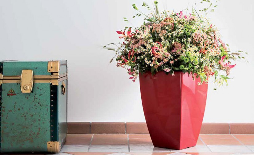
Deep red
It is another of the colours that dominated the last edition of the Milan Design Week. Embraces various shades from brick-red, evolution of terracotta color that has been very popular since some years, to auburn. As well as blue is the color of the sea, this range of reds confirms the earth as one of the most appreciated chromatic references also for 2020.
The combinations that enhance the most these nuances are their complementary, ranging from the classic blue to the shades of mustard-yellow, passing through the several hues of green.
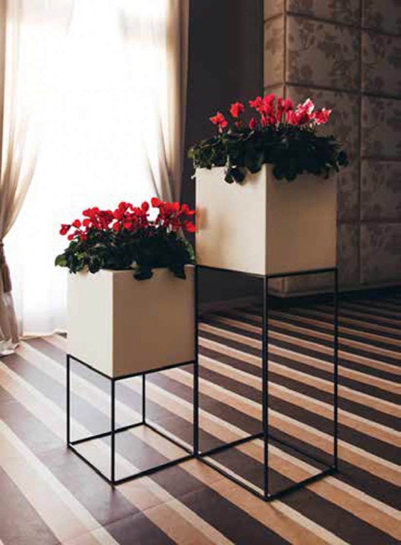
Green
Green is a colour conveying freshness, relax and sense of welcome, and it fits any type of style, increasing the perception of depth of the environments. Thanks to these characteristics, green is a color very hard to give up, and also this summer will be an unfailing protagonist.
As well as with a wide range of reds and purples, green is an excellent choice when is combined with natural materials and white, and is perfectly suitable with both classic and modern environments.
Orange and yellow
All the shades of orange and yellow are vivid and punchy colors, bringing a message of change and life force. They represent the sun, and that's why they are inevitable elements in the summer interior design of every house.
They lovely match wooden furnishings, brown, deep or auburn red, creating a warm and welcoming atmosphere, or deep blue, with a bold and original colour contrast. Orange and yellow also merge very well with a grey or another neutral colour background, resulting even more noticeable.
White and neural hues
Neutral hues as beige,light-grey, ivory and pastels never go out of fashion: their infinite variants combine with stronger colours, enhancing them even more. In fact, the secret for a flawless design of your house, is the proper use of neutral shades as transition and absorption colours.
Last but not least, white is the best trait d'union between any matching of different colours: dark and deep, brilliant and intense, or soft and pale. There is no colour that doesn't find in white a valuable ally to give the best of itself.